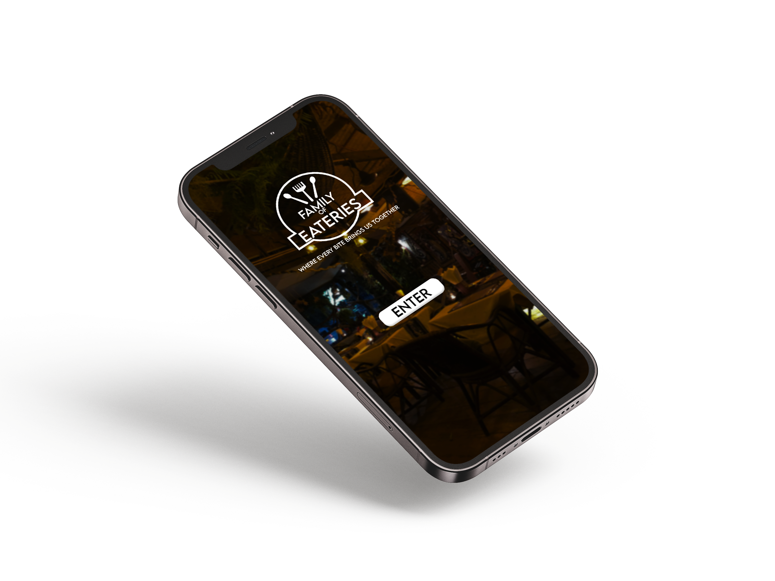
FAMILY OF EATERIES APP DESIGN
Designing a unified brand system for three distinct restaurant identities.


Challenge
How do you create three distinct restaurant brands that feel unique, while functioning cohesively under one unified parent identity?
Overview
The Family of Eateries project focused on building a cohesive brand system for a restaurant group made up of three distinct eateries. I designed a master brand identity alongside three individual restaurant logos, ensuring each maintained its own personality while remaining visually connected.
Role
I led the entire creative process from concept to final prototype — designing the brand system, visual identities, color palettes, wireframes, and user flow for the mobile experience.
Process
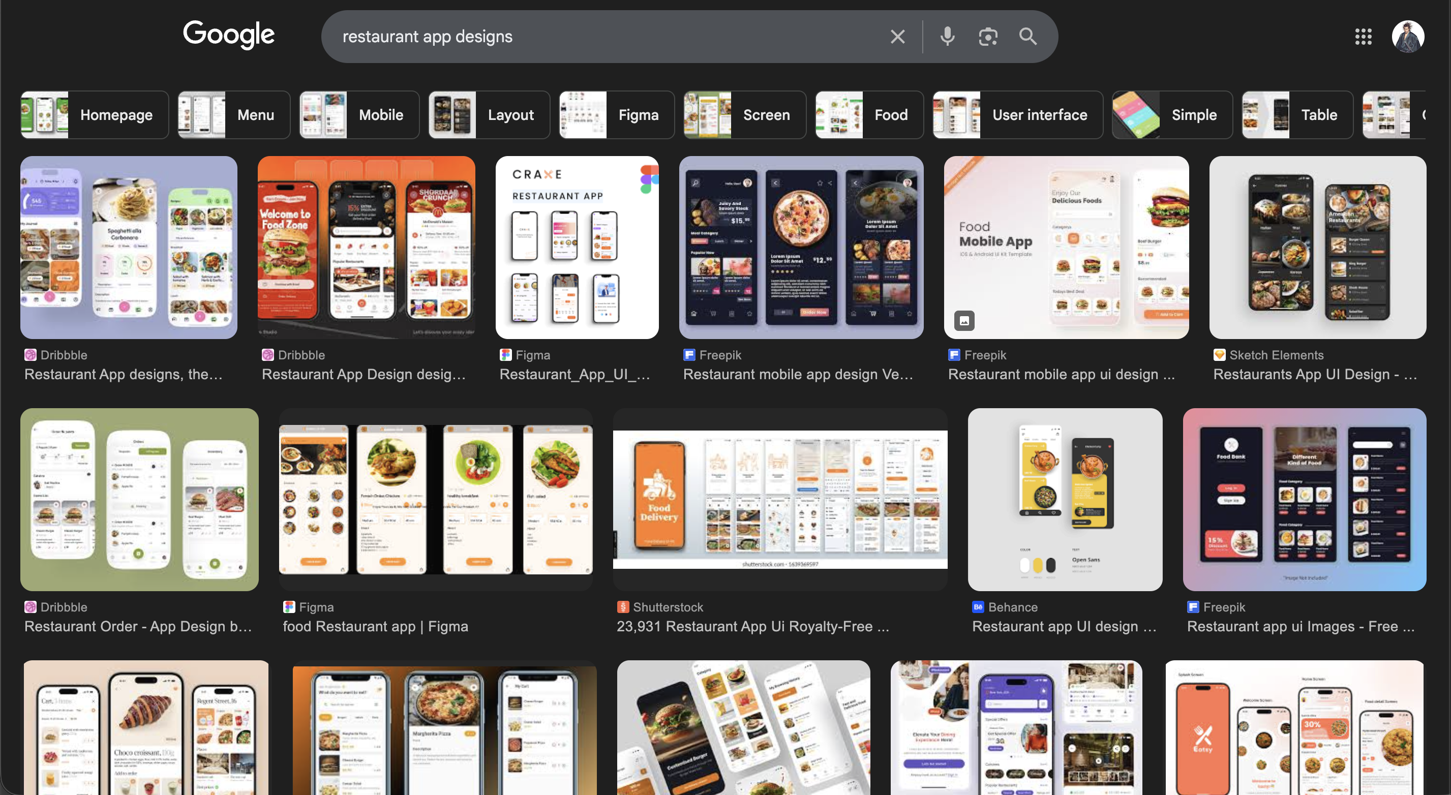
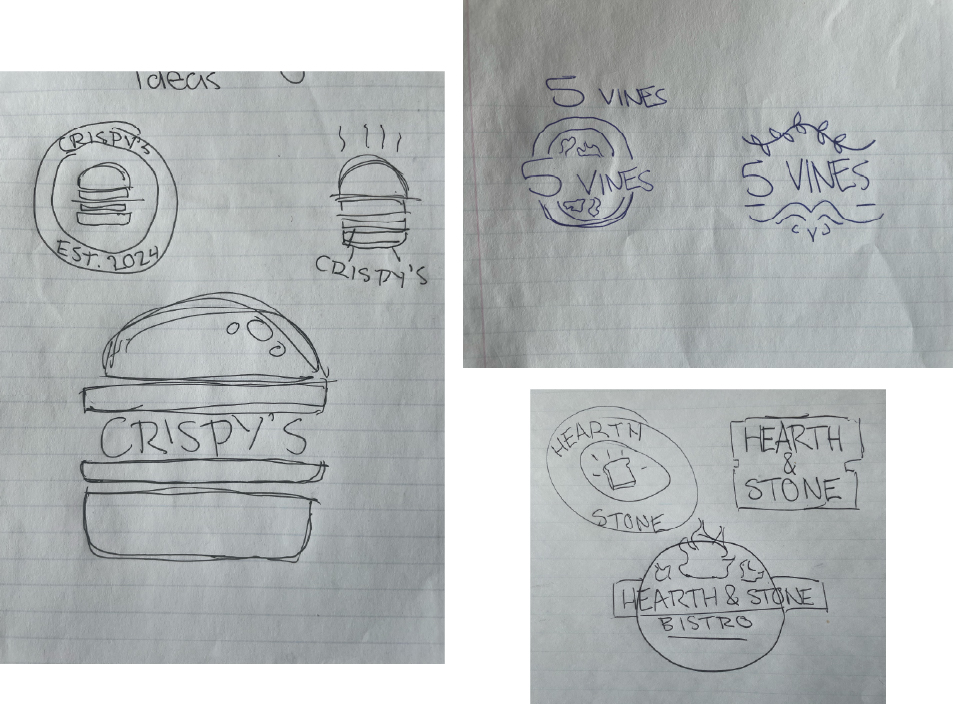
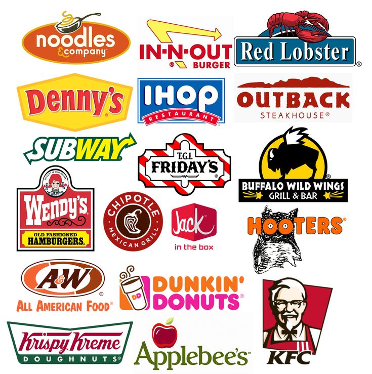
The process began with researching existing restaurant logos and mobile apps to understand common visual patterns, branding strategies, and user experience conventions. I gathered inspiration from a range of restaurant identities before developing initial sketches to explore logo directions and visual styles. In parallel, I analyzed restaurant app interfaces to inform layout structure, navigation flow, and interaction design, ensuring the final solution felt both visually cohesive and intuitive to use.
Brand System


Color Palette
#F111111
Primary Accent · Calls to Action · Highlights
#FF9D00
Primary Accent · Calls to Action · Highlights
#ED7B58
Primary Accent · Calls to Action · Highlights
#208200
Primary Accent · Calls to Action · Highlights
Typography
CRISPY'S
Primary Display: LEMON MILK
Supporting Typeface: Asimov Pro Bold
Crispy’s uses LEMON MILK for bold, high-impact headlines that reflect the brand’s energetic and modern personality. Asimov Pro Bold supports the layout with strong, clean typography for menu items and key UI elements.
HEARTH AND STONE BISTRO
Primary Display: Bohemian Soul
Supporting Typeface: Source Sans Pro
Hearth and Bistro pairs the expressive elegance of Bohemian Soul with the clarity of Source Sans Pro. The combination balances warmth and sophistication while maintaining strong readability across digital interfaces.
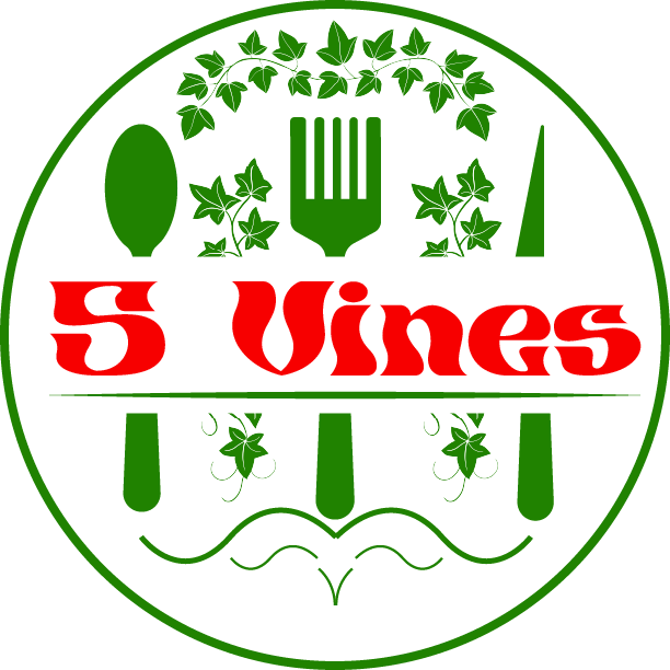
5 VINES
Primary Display: Baskerville
Supporting Typeface: Noto Serif
5 Vines utilizes Baskerville to communicate refinement and tradition, while Noto Serif enhances body copy with a timeless readable structure. Together they reinforce the restaurant’s elevated dining experience.
Brand Tone
The visual system balances warmth and refinement — combining bold condensed typography with earthy ingredient-driven color cues to reflect an elevated yet approachable dining experience.
UI System
Primary Actions
The interface uses high-contrast rounded buttons to emphasize call-to-action elements. Designed for thumb-friendly mobile interaction, the orange brand color creates strong hierarchy and visual consistency.
Menu Card System
Each menu item is presented within elevated cards featuring soft shadows and rounded corners. This reinforces warmth while maintaining clean visual separation between content blocks.

Category Navigation
A simplified tab navigation system allows users to switch between menu categories quickly. The active state uses the primary brand color for immediate feedback.
Wireframes & UX Flow
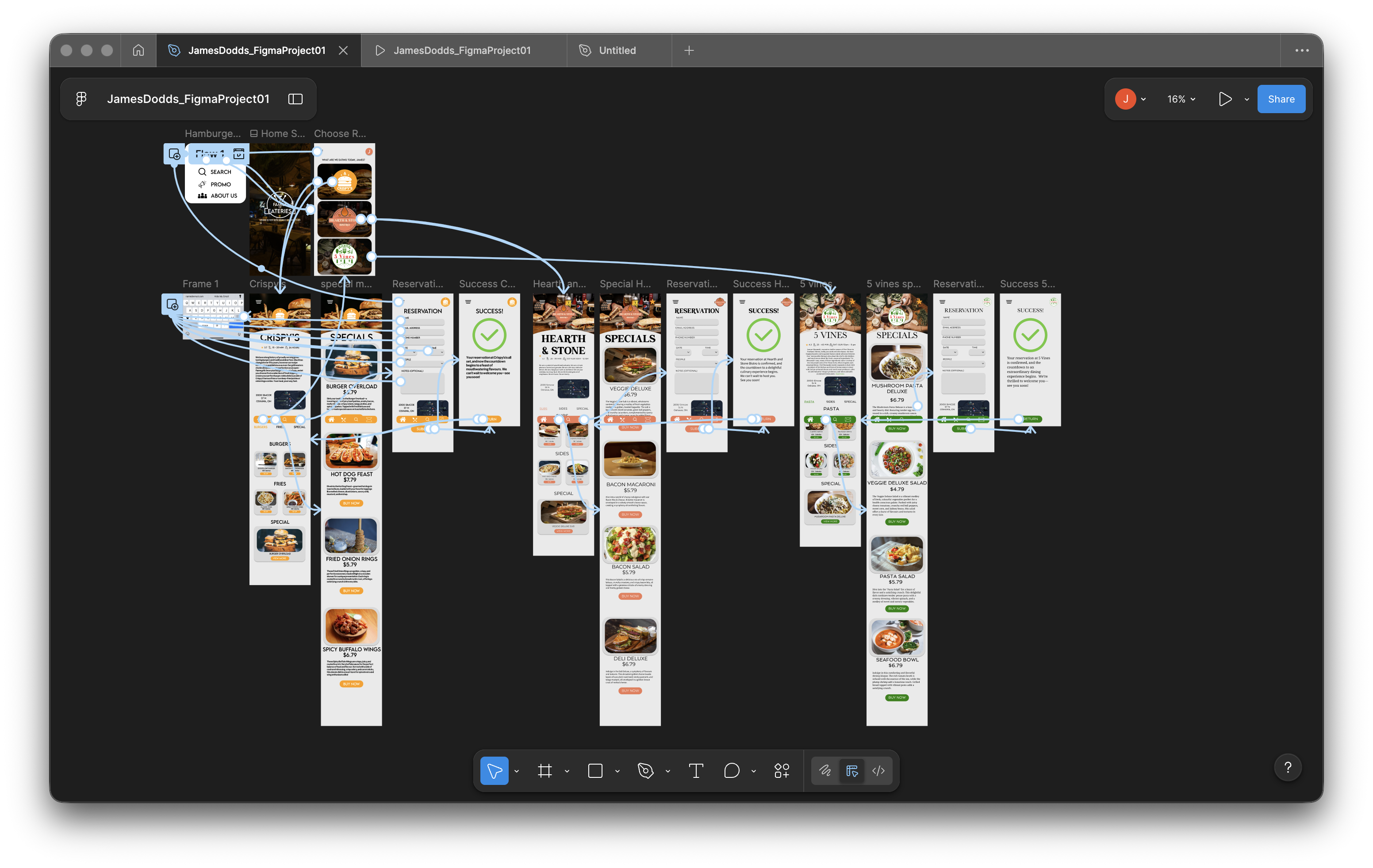 VIEW PROTOTYPE →
← OTHER PROTOTYPE LINK
VIEW PROTOTYPE →
← OTHER PROTOTYPE LINK